Can I have my Debian back?
So someone thought it might be a good idea to switch the default from the time-honoured Debian style ("booting foo... ok") to the RedHat style ("<left-align>booting foo... <right-align>[ok]"). I don't think the switch adds any value (it's not like it looked bad or anything in the past); in fact, I think it's a bad idea. And I even have a technical reason.
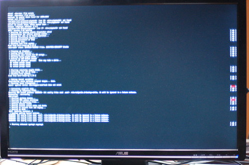
On my 26" 1920x1200 screen (when the i950 driver detects it properly and actually sets the framebuffer to that resolution), the output looks like this:
Now imagine you get to see that screen for about two to five seconds. Please tell me which two initscripts failed. And no, you cannot use a ruler. Bonus points for if you manage to do so while the text is also moving upwards, which tends to happen when systems boot.
Also note that because kernel mode-settings has become the default, a lot more people are going to be using framebuffers.
Am I the only one who thinks this is a bad idea?

I like neither that new setting nor the old one It would be awesome if the status was the the first thing printed on screen:
[ OK ] Starting some service...
The reason is simple: it would be easier to read if all statuses were aligned on the same column next to the status message. Otherwise, statuses will be placed at random places 'on screen' (end of the line, but that's relative to each line :)).
I don't know if that's implementable but it would be perfect
  So, between the old style and current new one, I'd tend to prefer the new one because "fails" are easier to catch on screen.
my 2 cents (maybe less
Looks like this is your own fault. Debian by default does not use such a style for boot messages (fwiw. I find them more readable but I get your point about high resolution, KMS terminals). I bet you installed usplash or splashy in the past, and now you have a file /etc/lsb-base-logging.sh which overrides the default lsb logging functions.
Just purge the file and be happy again.
A workaround for the main problem would be to have something like "max-width" (in web developer speak), e.g. 80 characters.
This would make the status wrap at a reasonable limit, e.g. 72 chars and add the status right aligned at 80 chars. This could then get "margin:auto", therefore being centered on-screen.
/ starting foo [ok] \ | starting bar [fail] | ...
Aligned is much better. I can't imagine how you think that, as a matter of graphic design, not aligning data makes it easier to distinguish and read. The only issue here is that the issue of line length[1] has been missed.
[1] http://desktoppub.about.com/cs/typelayout/a/linelength.htm
And the posibility to jump to COLUMN 0, to update the color:
Like I did in this post:
Anyway... I'm with you, K.I.S.S. was here for something.
Wouter,
what you are showing is not what Red Hat or Fedora does. They do not output the OK or FAILED messages at the complete right of the screen but keep 80 columns as a convention. The result is that the error-message is still very close to the description causing it. Which makes it still very useful and the feedback aligned.
I agree with you that the output you show is quite silly and impractical. But don't attribute that to Red Hat